The Psychology Behind Colors in UI/UX Design
Color is one of the most powerful tools in UI/UX design, capable of influencing emotions, behaviors, and perceptions. Understanding color psychology helps designers create interfaces that not only look appealing but also communicate effectively and guide user actions.
- Colors evoke specific emotional responses and associations
- Cultural context influences color perception and meaning
- Color combinations affect readability and accessibility
- Strategic color use can improve conversion rates and engagement
The psychology of color goes beyond aesthetic preferences—it's about creating meaningful connections between your brand, your users, and your interface. When used strategically, colors can enhance usability, convey information, and create memorable experiences.
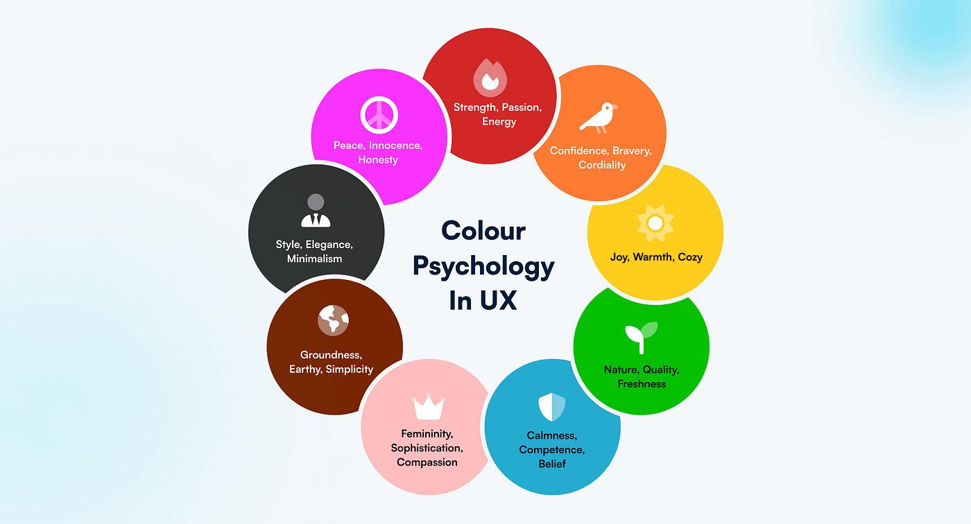
Understanding Color Psychology
Color psychology explores how different colors affect human emotions and behavior. While individual responses vary, certain color associations are consistent across cultures and can be leveraged in design.
Cultural Considerations in Color
Color meanings vary significantly across cultures. What represents trust in one culture might symbolize mourning in another. Understanding cultural context is crucial for global applications.
Strategic Color Application
Effective color use in UI/UX design follows several strategic principles:
- Establish clear color hierarchy for information organization
- Use color to reinforce brand identity and values
- Apply color psychology to influence user behavior
- Ensure color accessibility for users with visual impairments
- Test color combinations across different devices and lighting
Color is a silent communicator that speaks directly to users' emotions and subconscious, making it one of the most powerful tools in a designer's toolkit.
Emotional Impact of Colors
Different colors evoke distinct emotional responses. Blues convey trust and stability, reds create urgency and excitement, while greens suggest growth and harmony. Understanding these associations helps create appropriate emotional contexts.
Functional Color Usage
Colors serve functional purposes beyond aesthetics, including indicating status, highlighting important information, and creating visual hierarchy. Consistent color coding improves usability and reduces cognitive load.
Accessibility and Contrast
Color choices must consider accessibility requirements, ensuring sufficient contrast ratios and not relying solely on color to convey information. This inclusive approach benefits all users.
Brand Integration
Colors should align with brand values and personality while serving functional purposes. A well-integrated color palette reinforces brand recognition and creates cohesive user experiences.

Written by
FNA Team
CEO & Founder at FNA Technology
Specializing in AI, automation, and scalable software solutions — helping businesses leverage cutting-edge technology to drive growth and innovation.
Work with us