Dark Mode UI/UX: What the Best Practices Actually Mean in Code
The short version: Dark mode fails in predictable ways — pure black backgrounds, inverted images, broken contrast at real surface colors, and no state persistence across sessions. The fix is a token-based color system, correct contrast checking against actual surface values, and proper system preference detection with a user override mechanism.
Dark mode is not a color filter. That distinction sounds pedantic until you see what happens when a team treats it as one — the images look washed out, the contrast ratios are technically compliant against pure black but fail on real surfaces, and the toggle doesn't remember your choice between sessions.
Getting dark mode right requires decisions at the design token level, the CSS architecture level, and the JavaScript state level. This article covers all three, with the actual code patterns that hold up in production.
Why dark mode implementations fail
The most common mistakes, in rough order of frequency:
1. Using pure black as the base surface. #000000 backgrounds create extreme contrast against white text — higher than necessary, and fatiguing under extended use. Dark mode's purpose is reducing eye strain in low-light conditions. Harsh contrast defeats that purpose. Material Design 3 specifies #121212 as the baseline dark surface for good reason.
2. Inverting colors rather than theming them. CSS filter: invert(1) is not dark mode. It inverts images, breaks color meanings (red error states become cyan), and looks immediately wrong. Proper dark mode requires a separate token set, not a transformation of the light mode values.
3. Checking contrast against the wrong background. A common WCAG audit mistake: developers verify text contrast against #000000 and report a passing ratio. In production, the surface is #1A1A1A or #212121. The actual contrast ratio against those values is lower. Always check contrast against your real surface colors.
4. Missing state persistence. The user switches to dark mode. They navigate to another page. Light mode. This happens when the theme is set as a class on the <html> element via JavaScript on page load without reading localStorage first. A flash of incorrect theme on every page load.
5. No system preference detection. Users who have dark mode set at the OS level expect apps to respect that default, without manual configuration.
Color token architecture for dark mode
The pattern that scales is a two-layer token system: primitive tokens (actual hex values) and semantic tokens (contextual meaning). Components reference only semantic tokens. Theming changes only the semantic token values.
/* Primitive tokens — the raw values */
:root {
  --color-grey-900: #0D0D0D;
  --color-grey-850: #141414;
  --color-grey-800: #1C1C1C;
  --color-grey-100: #F5F5F5;
  --color-grey-200: #E8E8E8;
  --color-blue-400: #60A5FA;
  --color-blue-600: #2563EB;
  --color-red-400: #F87171;
  --color-red-600: #DC2626;
}

/* Semantic tokens — light mode defaults */
:root {
  --color-surface-base: var(--color-grey-100);
  --color-surface-elevated: #FFFFFF;
  --color-text-primary: #111111;
  --color-text-secondary: #555555;
  --color-border: #E0E0E0;
  --color-accent: var(--color-blue-600);
  --color-error: var(--color-red-600);
}

/* Semantic tokens — dark mode overrides */
[data-theme="dark"] {
  --color-surface-base: var(--color-grey-900);
  --color-surface-elevated: var(--color-grey-800);
  --color-text-primary: #F0F0F0;
  --color-text-secondary: #A0A0A0;
  --color-border: #2E2E2E;
  --color-accent: var(--color-blue-400);
  --color-error: var(--color-red-400);
}
With this setup, a component that uses var(--color-surface-base) for its background automatically adapts to dark mode. No component-level dark mode logic needed.
Elevation in dark mode: the surface layering system
In light mode, elevation is shown with shadow. In dark mode, shadows are nearly invisible against dark surfaces. The correct approach is to increase surface lightness as elevation increases — lighter surfaces appear closer to the user.
[data-theme="dark"] {
  /* Base surface */
  --elevation-0: #121212;

  /* Cards, dropdowns */
  --elevation-1: #1E1E1E;

  /* Modals, drawers */
  --elevation-2: #242424;

  /* Tooltips, toasts */
  --elevation-3: #2C2C2C;
}
The lightness step between levels is typically 5–8%. This matches the Material Design dark theme elevation overlay specification. Going smaller makes the levels indistinguishable; going larger creates flat-looking interfaces where everything appears to be the same layer.
Contrast ratios: what WCAG actually requires
WCAG 2.1 AA requires:
- 4.5:1 for normal text (under 18pt or 14pt bold)
- 3:1 for large text (18pt+ or 14pt+ bold) and UI components
Dark mode introduces a specific pitfall: light-colored text on dark-colored backgrounds can still fail contrast if the surface isn't dark enough or the text isn't light enough.
Surface: #1C1C1C (dark mode elevated surface)
Text: #E0E0E0 (common secondary text color)

Relative luminance of #1C1C1C: 0.0106
Relative luminance of #E0E0E0: 0.7215

Contrast ratio = (0.7215 + 0.05) / (0.0106 + 0.05) = 12.6:1 ✓ passes AA and AAA
Compare with a common mistake:
Surface: #1C1C1C
Text: #888888 (medium grey used as "secondary" text in dark mode)

Relative luminance of #888888: 0.2158
Contrast ratio = (0.2158 + 0.05) / (0.0106 + 0.05) = 4.4:1 ✗ fails AA by 0.1
That #888888 secondary text color fails. It's a ratio most designers eyeball as "looks fine" but doesn't pass. Use the WebAIM Contrast Checker with your actual surface and text values — not assumed ones.
System preference detection and state management
// Read system preference
const systemPrefersDark = window.matchMedia('(prefers-color-scheme: dark)');

// Read stored user preference
const storedTheme = localStorage.getItem('theme');

// Apply theme: stored preference wins over system default
function applyTheme(theme) {
  document.documentElement.setAttribute('data-theme', theme);
  localStorage.setItem('theme', theme);
}

// Initial load — apply before first paint to avoid flash
const initialTheme = storedTheme || (systemPrefersDark.matches ? 'dark' : 'light');
applyTheme(initialTheme);

// Listen for system preference changes (user changes OS setting)
systemPrefersDark.addEventListener('change', (e) => {
  // Only apply system change if user hasn't made an explicit choice
  if (!localStorage.getItem('theme')) {
    applyTheme(e.matches ? 'dark' : 'light');
  }
});
The critical detail: apply the theme before the first paint. In Next.js, this means running the theme detection in a <script> tag inside <head>, before the React hydration. Otherwise, the page flashes light mode before switching to dark on every load.
// _document.tsx or app/layout.tsx <head>
<script dangerouslySetInnerHTML={{
  __html: `
    (function() {
      const stored = localStorage.getItem('theme');
      const systemDark = window.matchMedia('(prefers-color-scheme: dark)').matches;
      const theme = stored || (systemDark ? 'dark' : 'light');
      document.documentElement.setAttribute('data-theme', theme);
    })();
  `
}} />
Image handling in dark mode
Photographs: reduce brightness slightly to prevent them standing out too harshly against dark surfaces.
[data-theme="dark"] img {
  filter: brightness(0.85);
}
SVG icons: if they use hardcoded fill colors, they will not adapt automatically. Use currentColor so they inherit the text color of their parent.
<!-- Wrong — hardcoded fill -->
<path fill="#000000" d="..." />

<!-- Correct — inherits currentColor -->
<path fill="currentColor" d="..." />
Logos and brand marks that use black on transparent backgrounds need a separate dark-mode version, or they will disappear. A <picture> element with a media query handles this:
<picture>
  <source srcset="/logo-white.svg" media="(prefers-color-scheme: dark)" />
  <img src="/logo-dark.svg" alt="Company logo" />
</picture>
Note: this approach reads from the system preference, not from your stored user preference. For applications with a manual toggle, serving the correct logo version requires JavaScript to swap the src attribute based on the active theme.
What to check before shipping dark mode
- Background surfaces use dark greys, not pure black
- Contrast checked against real surface values (not
#000000) using WebAIM or Figma contrast plugin - Elevation system uses lightness stepping, not shadows
- All icons and illustrations use
currentColoror have dark mode variants - Logos with black fill have white/light alternatives for dark mode
- Theme applied before first paint to avoid flash
- User preference persisted in
localStorage - System preference changes respected when no explicit user choice exists
- Semantic color tokens used throughout — no hardcoded hex values in component styles
Who needs a full token system vs. a simpler approach
If you're building a design system used across multiple products or teams, the two-layer token architecture is worth the setup cost. Changes to dark mode semantics propagate everywhere automatically.
For a single web application or marketing site, a simpler approach works fine: one set of CSS custom properties at :root, overridden in a prefers-color-scheme media query. No data-theme attribute needed unless you require a manual toggle that overrides the system setting.
The limitation of pure media-query dark mode: you can't give users a manual toggle without JavaScript. If users expect to switch themes independently of their OS setting — and most do — you need the JavaScript state layer described above.
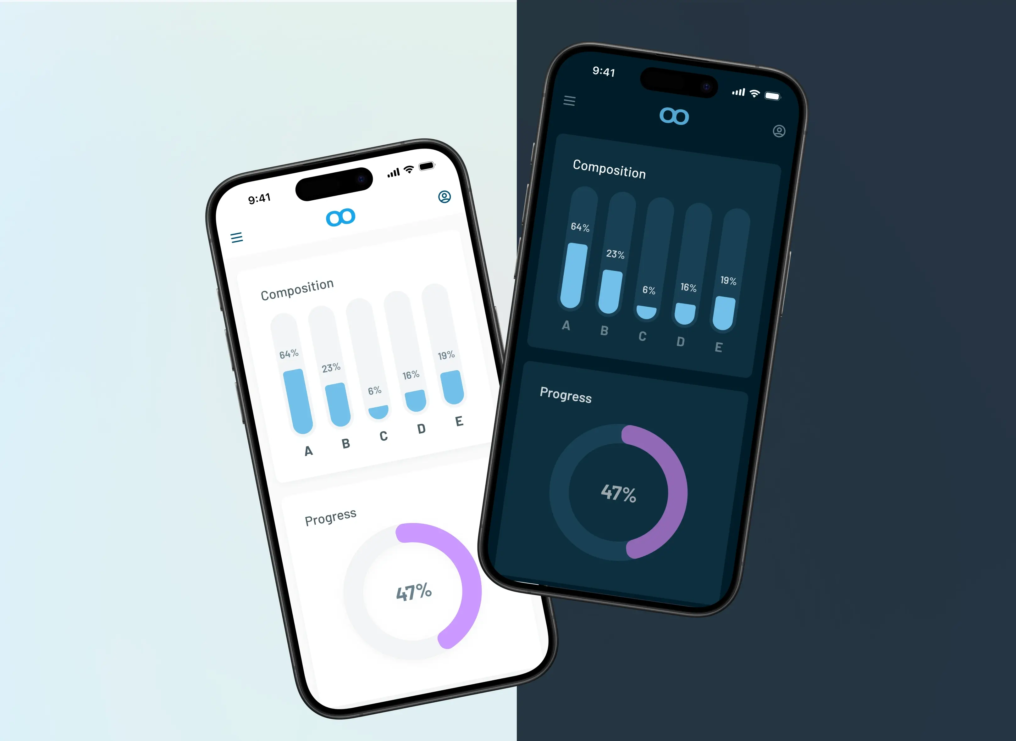
For dark mode decisions that intersect with mobile app UI, the accessibility considerations in app development article covers how these same contrast and preference-detection principles apply in native iOS and Android contexts.
Frequently Asked Questions

Written by
FNA Team
CEO & Founder at FNA Technology
Specializing in AI, automation, and scalable software solutions — helping businesses leverage cutting-edge technology to drive growth and innovation.
Work with us