UI Design Workflow: From Wireframes to Polished UI Without the Rework
The short version: Most UI rework traces back to one mistake — making visual design decisions before information architecture is settled. The correct sequence is: user flows first, wireframes to confirm structure, design system tokens before any high-fidelity screens, then visual design on a solid foundation. Each phase has specific decisions that belong to it. Mixing them causes rework.
The most expensive phase of UI design is not the design itself — it's the revision cycles after development starts and someone notices that the information hierarchy doesn't work, the navigation is confusing, or a component doesn't scale to the content it needs to hold. Almost all of that rework is preventable by front-loading the right decisions.
Phase 1: User flow mapping before wireframes
The mistake most teams make is starting with wireframes. Wireframes show screen layout. But before you know what goes on a screen, you need to know what the user is trying to accomplish and in what sequence.
User flow mapping answers: what brings a user to this screen, what do they need to do, what are the possible outcomes, and where do they go next.
Tools: FigJam, Miro, or even a whiteboard. This is not Figma time yet.
What to produce: A flow diagram showing:
- Entry points (how users reach each screen)
- Decision points (where the user has choices)
- Success and error paths
- Exit points (where the flow ends or continues elsewhere)
A checkout flow has at minimum: cart review → address entry → payment entry → order confirmation → confirmation email. It also has: address validation failure, payment decline, out-of-stock item discovered at checkout. Map the error paths during this phase, not during wireframing.
Deliverable: A shared flow diagram reviewed and agreed upon by product, design, and at least one developer before wireframing starts. Disagreements about user flow that surface during wireframing cost significantly more than disagreements caught here.
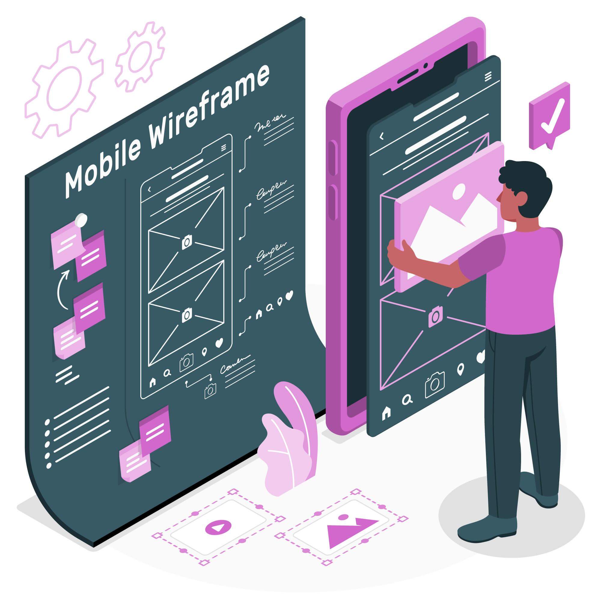
Phase 2: Low-fidelity wireframes for structure decisions
Wireframes confirm that your user flow maps to actual screen layouts. They answer structural questions, not visual ones.
Low fidelity means:
- Greyscale only — no color decisions
- Placeholder images (grey rectangles)
- Generic typography (no font choices)
- Boxes and lines for components, not actual component designs
What wireframes should decide:
- Content hierarchy — what's most important on this screen, what's secondary
- Navigation placement — where is the primary navigation, how do sub-sections work
- Component slots — where does the call-to-action live, where is supporting information
- Responsive breakpoints — does this layout work at mobile width, or does it need a fundamentally different structure
What wireframes should NOT decide:
- Colors
- Typography choices
- Icon styles
- Illustration or photography treatment
- Micro-interaction behavior
A wireframe session that produces a 120px blue #2563EB primary button has gone off track. That's a visual design decision being made in the wrong phase, which means it'll either get thrown away or carry forward by accident.
Typical output: 1–3 wireframe variants per key screen, reviewed with stakeholders before any visual design begins. Iterate at this stage — changes to wireframes cost hours. Changes to high-fidelity designs with a built component library cost days.
Phase 3: Design tokens before screens
This phase is skipped most often and causes the most handoff problems.
Before designing a single high-fidelity screen, define your semantic token set:
Color tokens:
color-primary: #2563EB
color-primary-hover: #1D4ED8
color-secondary: #7C3AED
color-surface-base: #FFFFFF
color-surface-elevated: #F9FAFB
color-text-primary: #111827
color-text-secondary: #6B7280
color-error: #DC2626
color-success: #16A34A
color-border: #E5E7EB
Spacing tokens (4px base grid):
spacing-1: 4px
spacing-2: 8px
spacing-3: 12px
spacing-4: 16px
spacing-6: 24px
spacing-8: 32px
spacing-12: 48px
spacing-16: 64px
Typography tokens:
font-size-xs: 12px / 1.5
font-size-sm: 14px / 1.5
font-size-base: 16px / 1.5
font-size-lg: 18px / 1.75
font-size-xl: 20px / 1.75
font-size-2xl: 24px / 1.3
font-size-3xl: 30px / 1.3
In Figma, define these as Variables (not styles). Figma Variables map directly to CSS custom properties — developers can reference the same token names in code, eliminating the translation step where values get misinterpreted.
Phase 4: Component library in Figma
Build your core components before designing screens. Screens are assembled from components, not designed from scratch.
Core components to build first:
- Button (primary, secondary, ghost, destructive — each with default, hover, disabled, loading states)
- Input fields (text, password, select, textarea — each with default, focus, error, disabled states)
- Form layout (label + input + error message pattern)
- Card (with and without image, with and without action)
- Navigation (desktop and mobile variants)
- Modal / sheet
- Toast / notification
- Badge / tag
Each component should:
- Use auto layout (Figma's equivalent of CSS flexbox)
- Reference tokens — not hardcoded values — for colors, spacing, and typography
- Have all interactive states included in the component variants
Building components with hardcoded values means every developer who implements the component makes their own interpretation of the spacing and color. Building with tokens means the CSS implementation naturally matches the design when both reference the same token names.
Phase 5: High-fidelity screen design
With tokens defined and components built, screen design becomes faster and more consistent. You're assembling from an established system, not inventing on every screen.
What changes at this phase:
- Real content replaces placeholder text and images
- Photography, illustration, and iconography decisions are made
- Responsive variants are designed (mobile, tablet, desktop)
- Edge cases are explicitly designed: empty states, loading states, error states, long text content
Empty states are required, not optional. A data table that shows "No orders found" needs a design. A dashboard that shows no activity for a new user needs a first-run experience design. Leaving these to developer interpretation produces inconsistent, often confusing empty states in production.
Phase 6: Developer handoff
The gap between "looks right in Figma" and "looks right in browser" is almost always a documentation problem.
What a complete handoff includes:
-
Named components — every component in Figma named exactly as it will be named in code. If the developer implements it as
<PrimaryButton>, the Figma component should be called PrimaryButton. -
Token references documented — use Figma's Dev Mode to expose token values. Developers should see
color-primarynot#2563EBin the inspect panel. -
Spacing annotations — for complex layouts where the grid relationship isn't obvious, annotate spacing values explicitly rather than assuming the developer will measure from the design.
-
Interaction notes — for hover states, transitions, and micro-interactions, write notes or link to a prototype. Figma's static frames don't communicate timing and easing.
-
Responsive behavior — document how components resize at breakpoints. Does the card stack vertically at mobile? Does the navigation collapse to a hamburger? Specify the breakpoint values.
-
Assets exported — SVG icons at the correct viewBox, images at 1x/2x/3x for different pixel densities, any custom illustrations as SVG with correct layer structure.
The test for a complete handoff: a developer who has not attended any design meetings should be able to implement the screen correctly from the Figma file and documentation alone. If implementation requires a live conversation to clarify intent, the handoff was incomplete.
For teams building mobile applications alongside web interfaces, the design token approach described here applies directly to React Native with the same token names — the importance of UI/UX in app development article covers how design system decisions translate across platforms.
Frequently Asked Questions

Written by
FNA Team
CEO & Founder at FNA Technology
Specializing in AI, automation, and scalable software solutions — helping businesses leverage cutting-edge technology to drive growth and innovation.
Work with us